Category: Copy
-
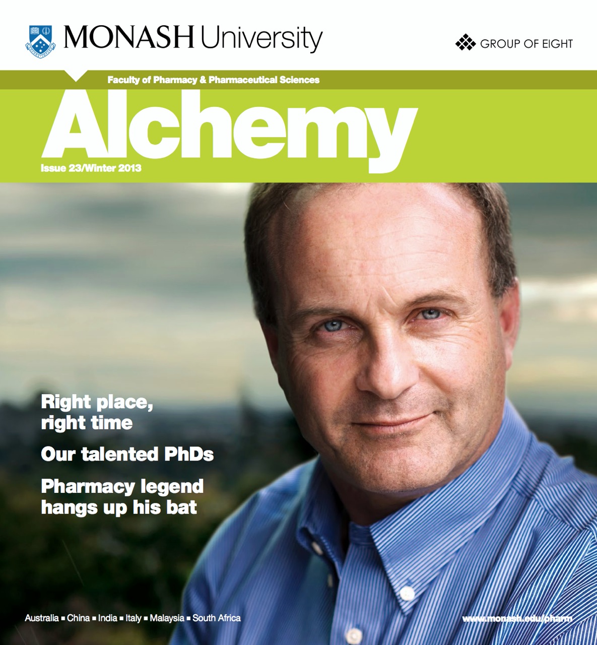
Monash Alchemy Mag – Winter 2013
Delighted to be working with the very bright sparks at the Monash Institute of Pharmaceutical Sciences. Provided a number of feature stories and student profiles for the Winter 2013 issue of their Alchemy Magazine. Have a read.
-
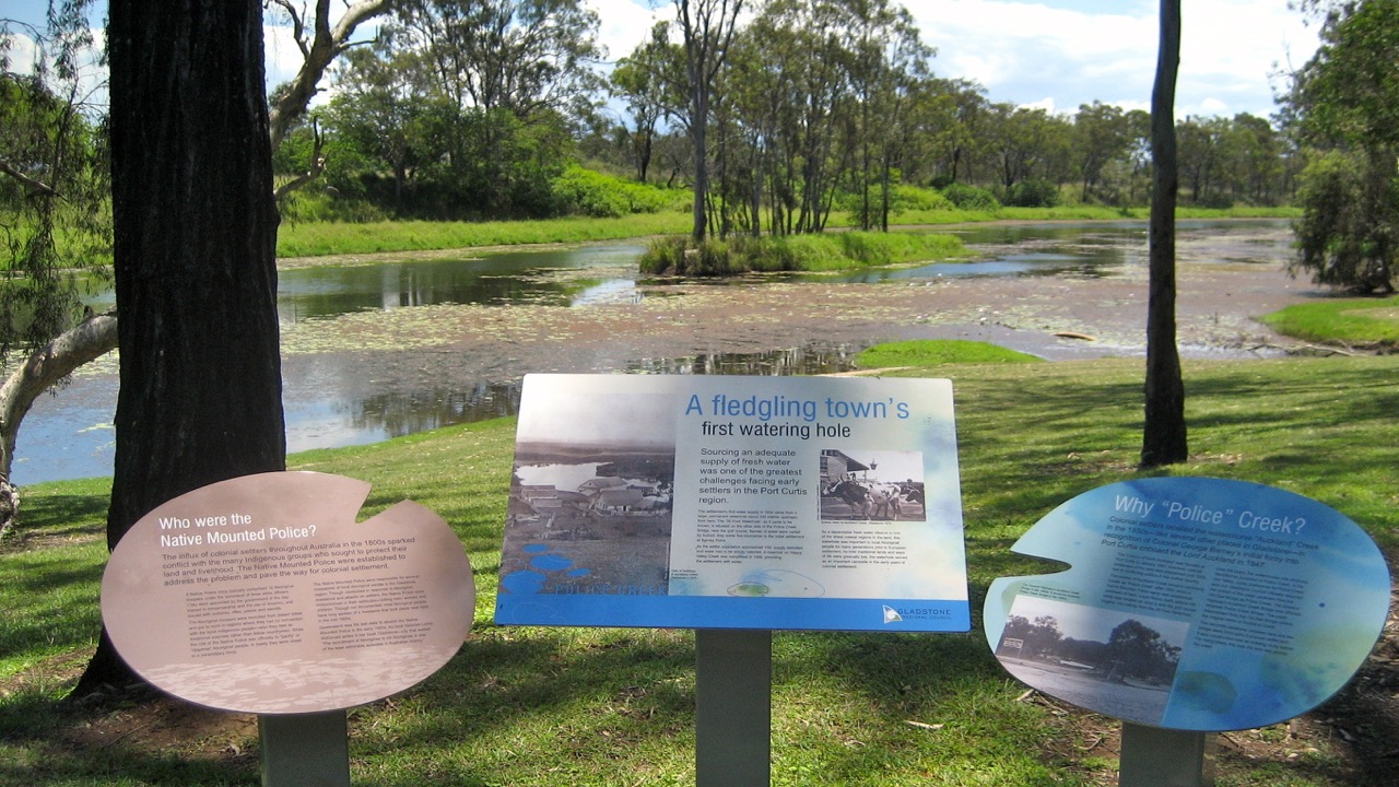
Gladstone’s Police Creek interpretive signage
Police Creek is an important part of Gladstone’s natural environment, local history and cultural heritage. This series of interpretive signs along a popular walking trail in Gladstone explains the historical, environmental and cultural significance of the local watercourse. The signage details the life and history of the creek, including some rather confronting and previously undocumented…
-
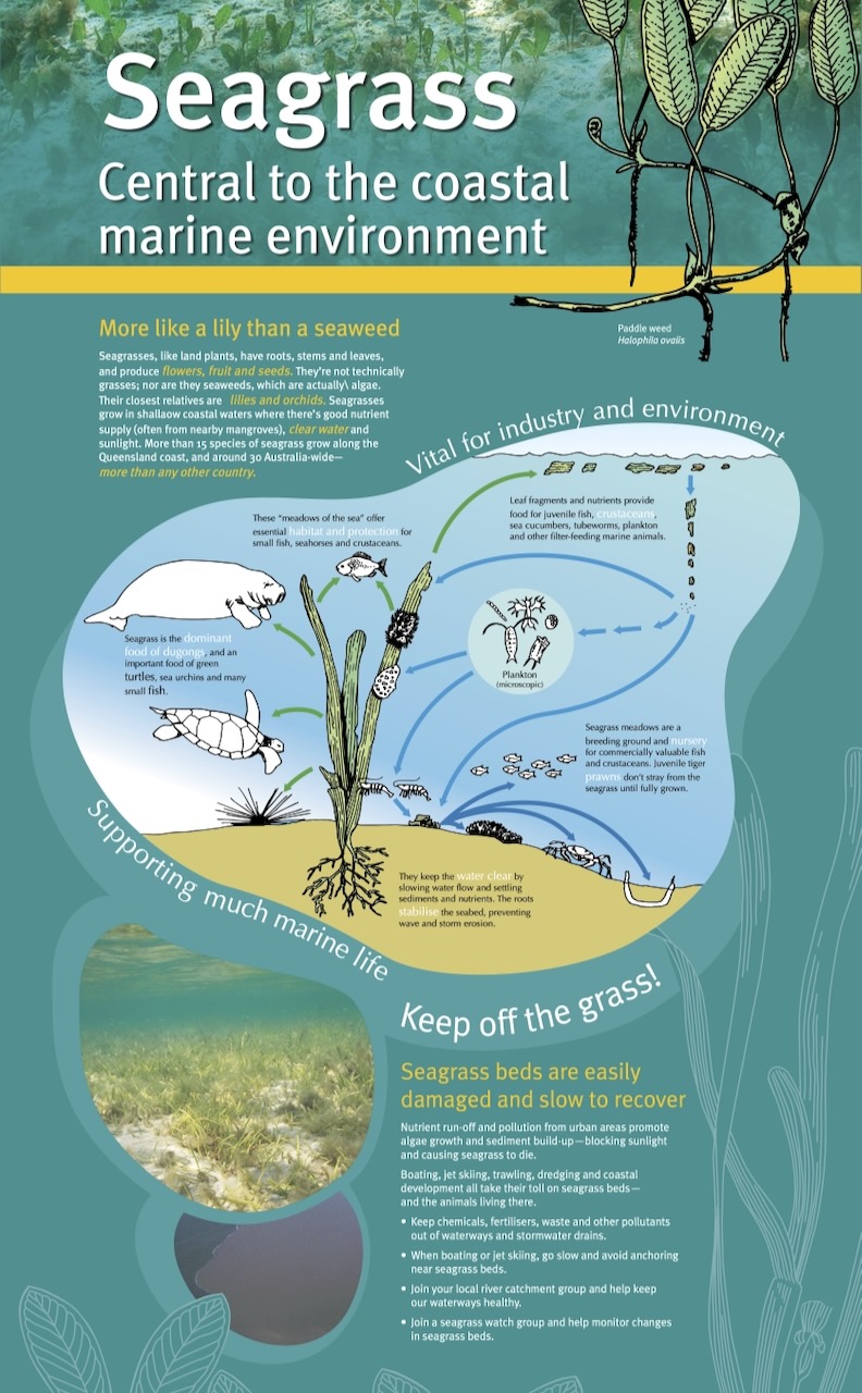
QPWS marine life mobile display
A series of interpretive banners exploring the Queensland coastal marine environment. Part of a mobile display for QPWS. Client: Qld Parks & Wildlife Service | Design: See-Saw
-
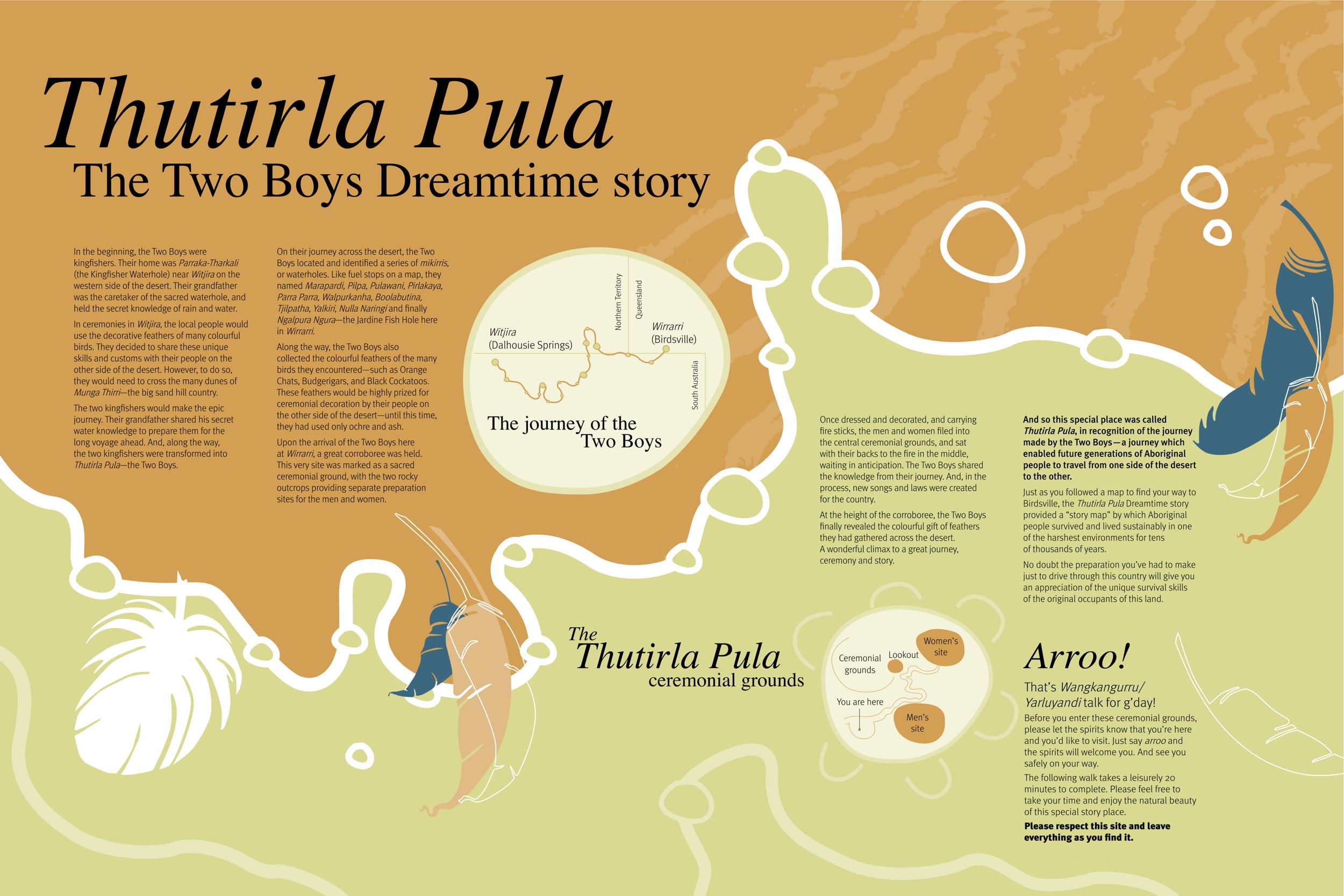
Birdsville’s Thutirla Pula Story Place interpretive signage
One of the most important Dreamtime stories from Central Australia is that of Thutirla Pula—the Two Boys. This series of interpretive signs at a significant Aboriginal ceremonial site in the Queensland Outback town of Birdsville presents a local telling of the story. Working with designer Adrienne Williams from See-Saw, we travelled to the very remote Birdsville to survey…
-
Arkhefield 92|07: the first fifteen years
We be Arkhefield After 15 years of practice, Arkhefield had created some very impressive buildings, but they’d never done a brochure. So, to mark a decade-and-a-half, they decided to commit a few projects to print. Not ones to do things by halves, this booklet is the result. It made the shelves of a few specialty…
-
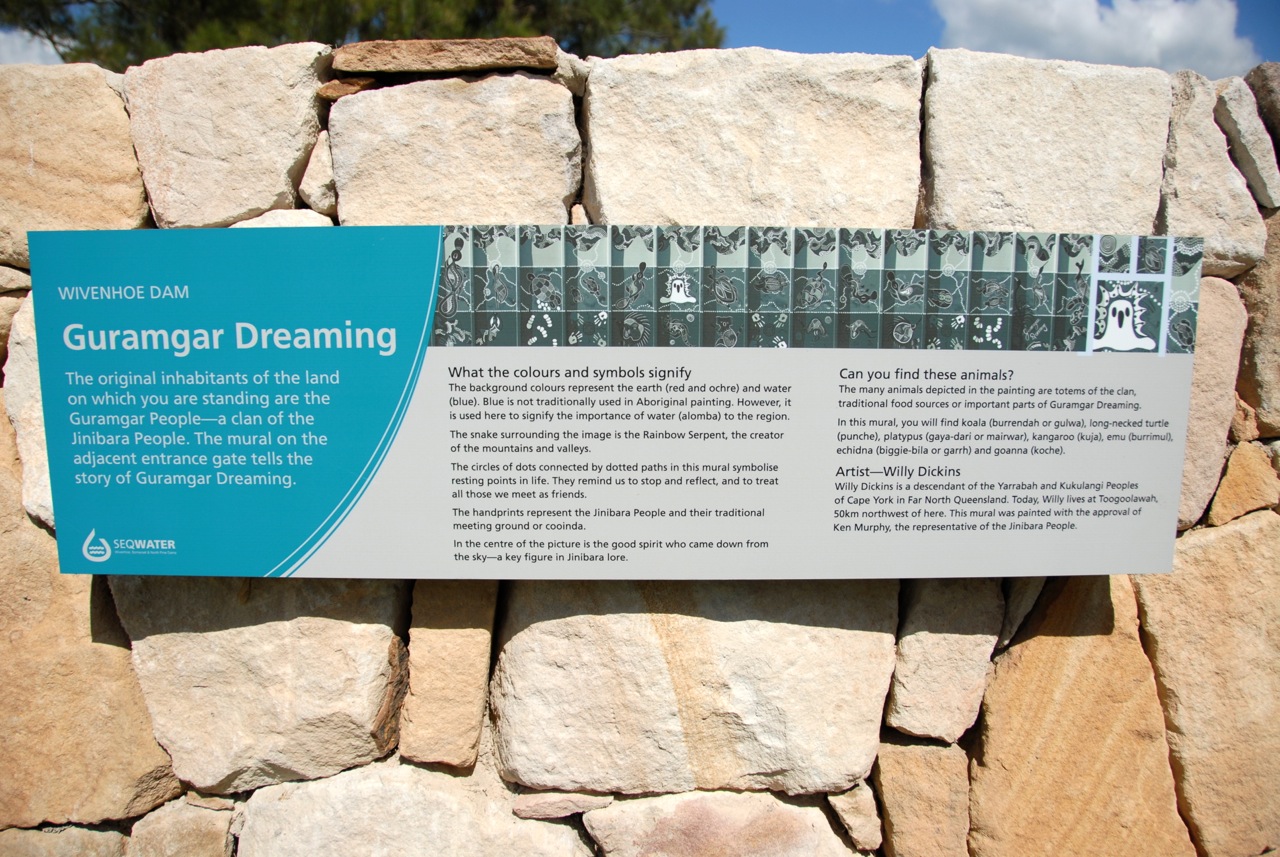
Wivenhoe Dam interpretive signage
Like most dams, Wivenhoe serves several functions. A series of 10 interpretive signs about the dam, river, local Aboriginal culture, native flora and fauna, and recreational activities. Interesting stuff. Oh and there’s a lovely story about a little forest that a local school built and named—see the Ferncassy Forest sign. Client: Wivenhoe Alliance | Design:…
-
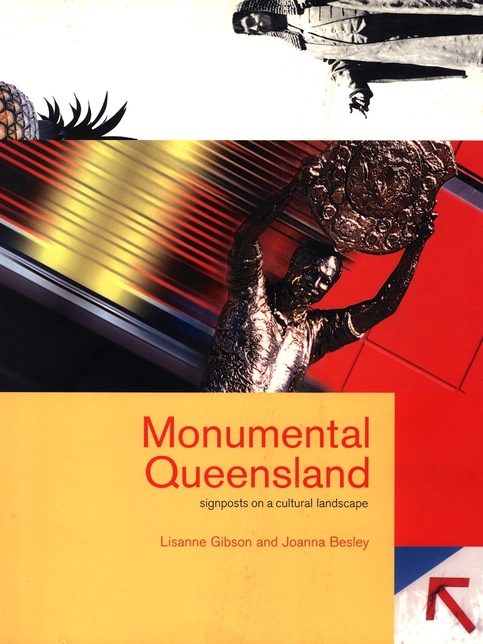
Monumental Queensland
These signposts on Queensland’s cultural landscape provide a guide to our unique stories and histories—a vivid portrayal of what make us “us”. Title concept and cover blurb for Lisanne Gibson and Jo Besley’s book on Queensland’s distinctive public monuments and big things. Publisher: UQP | Client: Public Art Agency, Arts Queensland | Design: Designfront
-
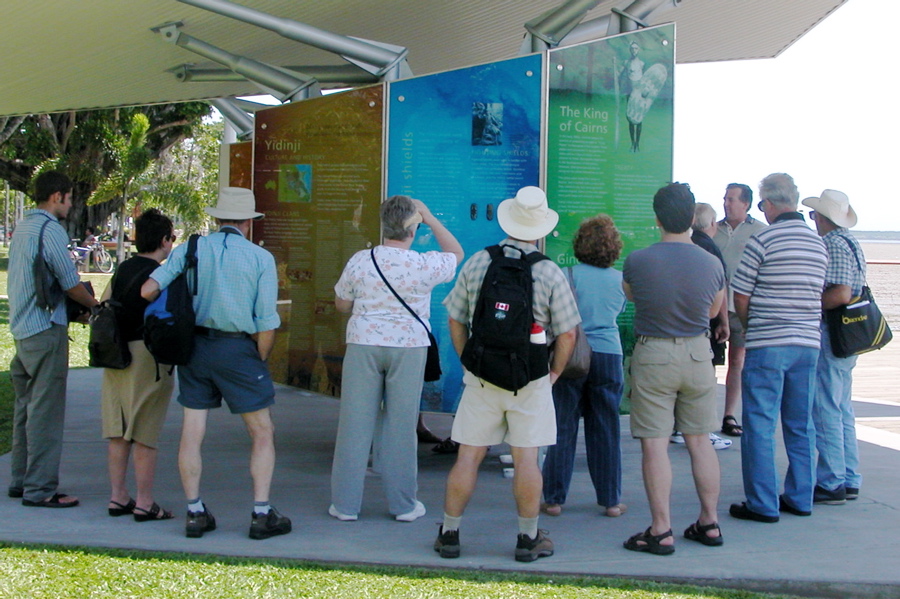
Cairns Indigenous heritage display
The colonists never left, but the free food and blankets didn’t last. A series of six interpretive display panels on Cairns Esplanade exploring the region’s Indigenous history and cultural heritage. The copy was researched and written in consultation with Yidinji and Yirriganydji elders. Client: Cairns City Council | Design: Dot Dash
-
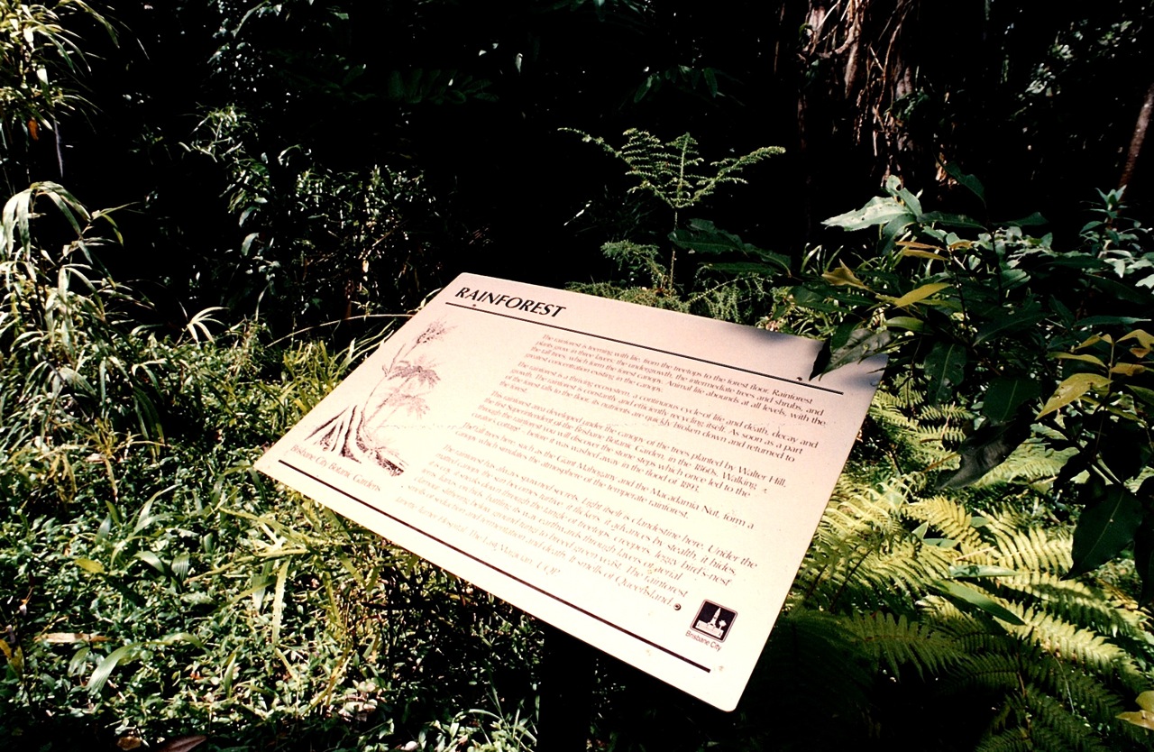
Brisbane City Botanic Gardens interpretive signage
A dozen or so interpretive signs that talk about the gardens’ history and tell the story of some interesting, significant and spooky specimens.
-
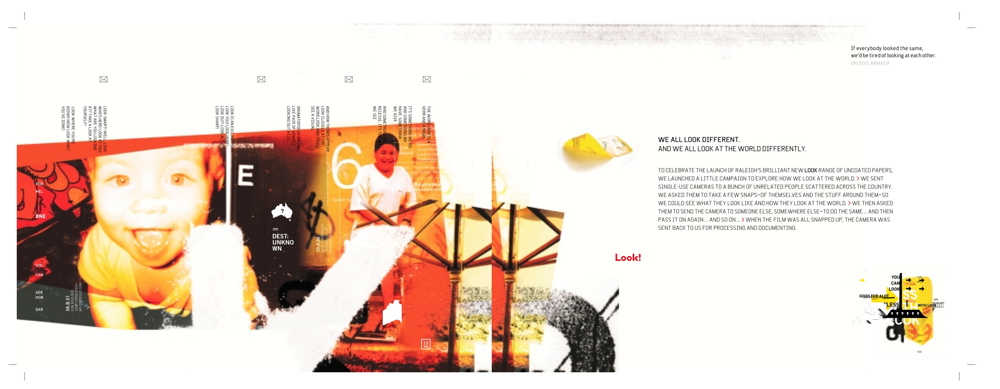
Raleigh Paper “LOOK!” book
We all look different. And we all look at the world differently. Long story. And a long time ago now, but still a favourite … Raleigh Paper had a new stock to promote called “LOOK!”. They asked Myke Christoffel and Todd Hansson at Gasket to do a promo piece that would appeal to edgy design…
