-

Sorry the place is such a mess – I’m doing a spot of housekeeping
-
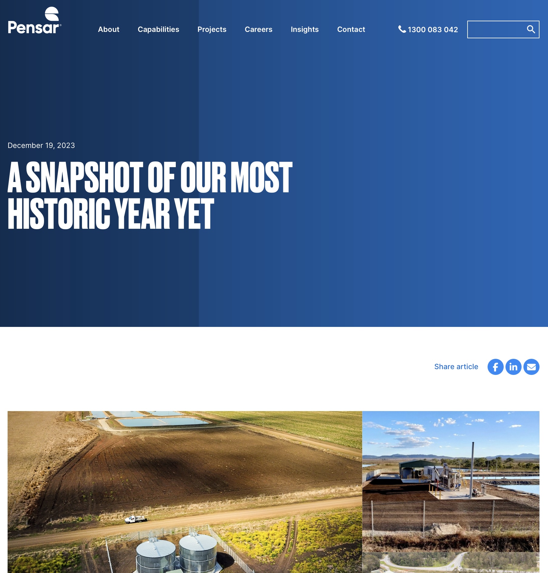
Pensar: celebrating innovative infrastructure
-
Lutheran Services 2023 annual report
-
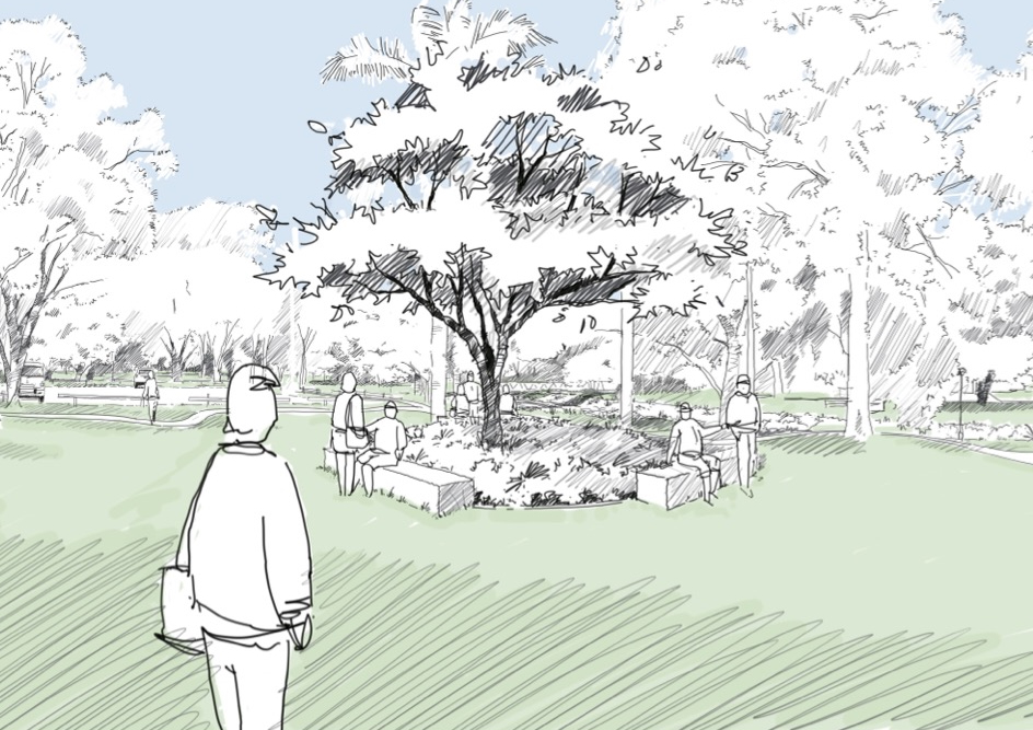
Corscadden Park interpretive signage
-
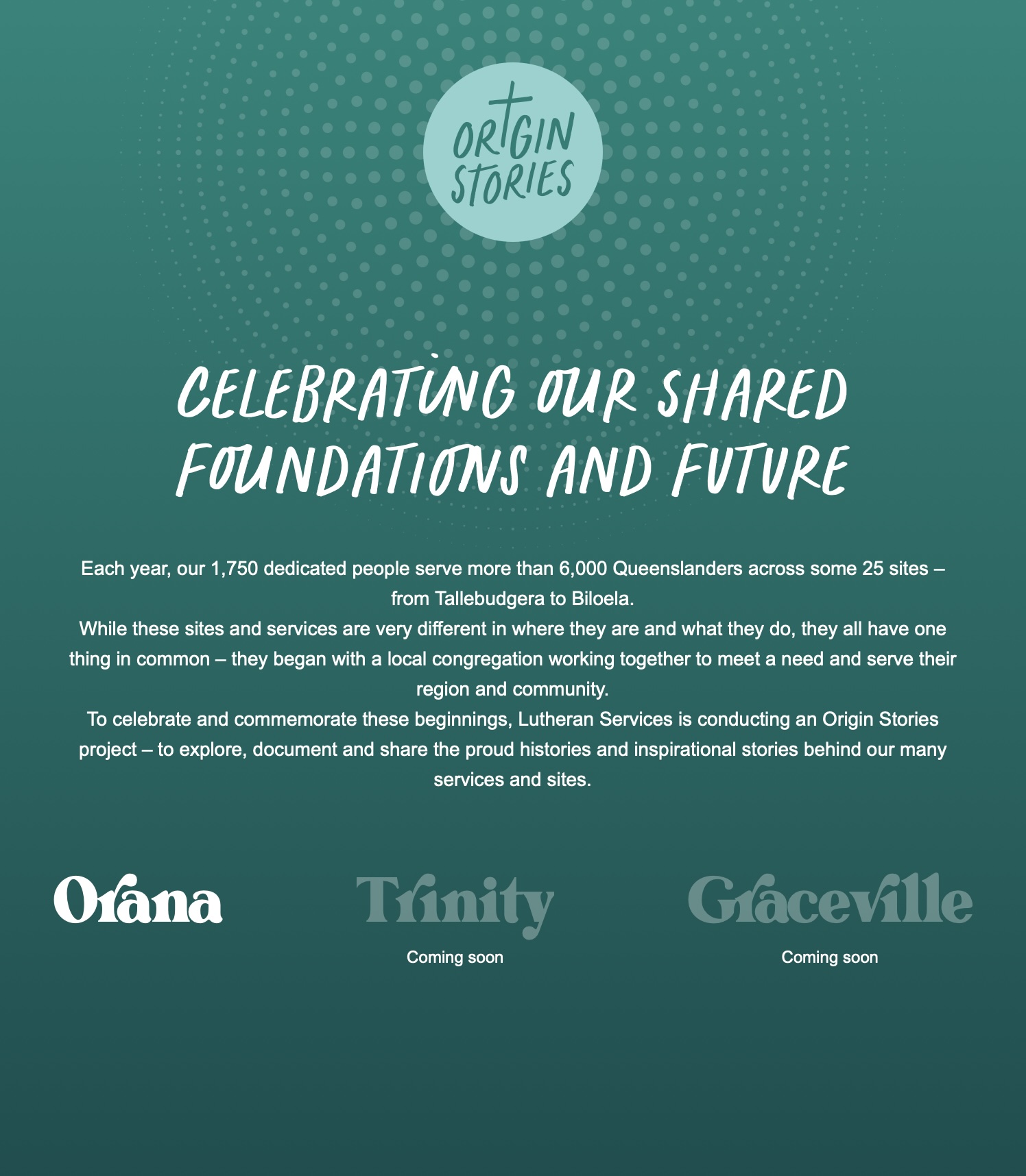
Lutheran Services Origin Stories
-
UniSC corporate capability brochure
-
Lutheran Services 2022 annual report
-
USC Moreton Bay Campus
-
Lutheran Services 2021 annual report
-
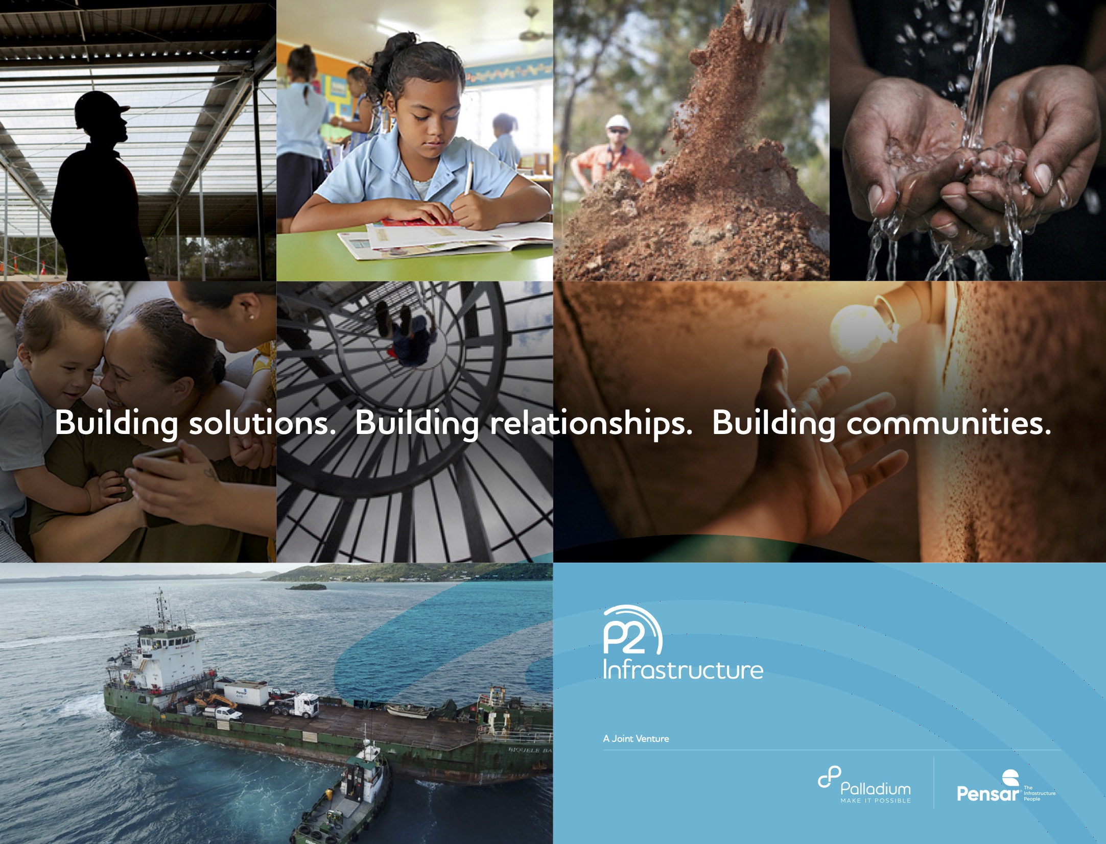
P2 Infrastructure
-
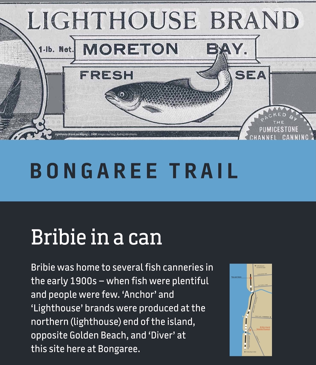
Bongaree Trail interpretive signage
-

Lutheran Services 2020 annual report
-

Pulse app
-
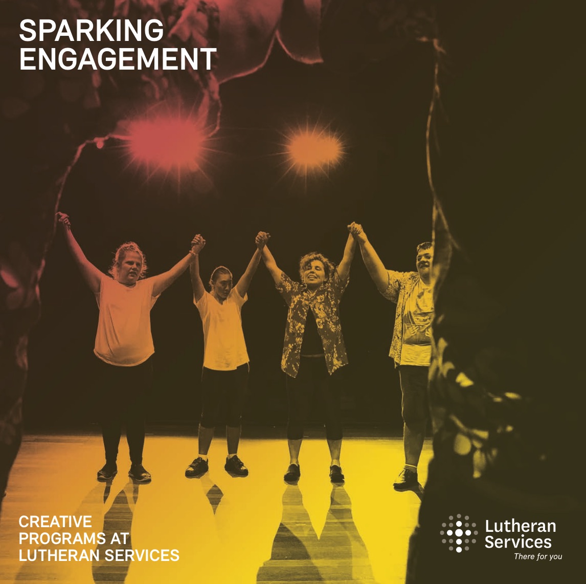
Sparking engagement: creative engagement programs at Lutheran Services
-
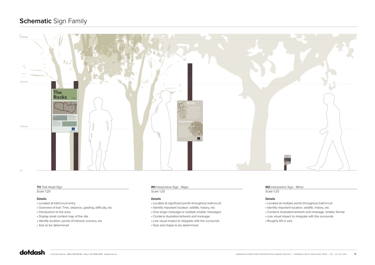
Karawatha Forest Park interpretive signage